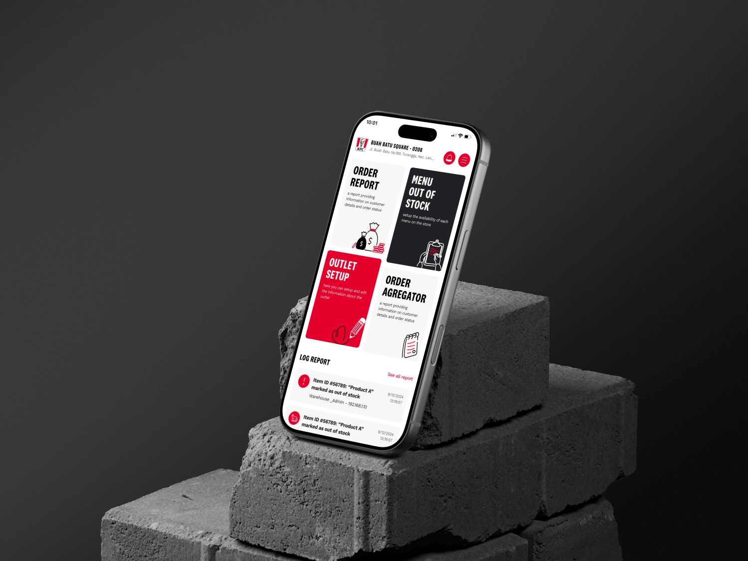
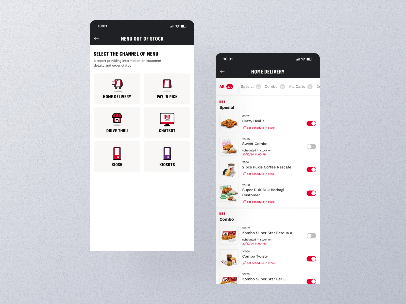
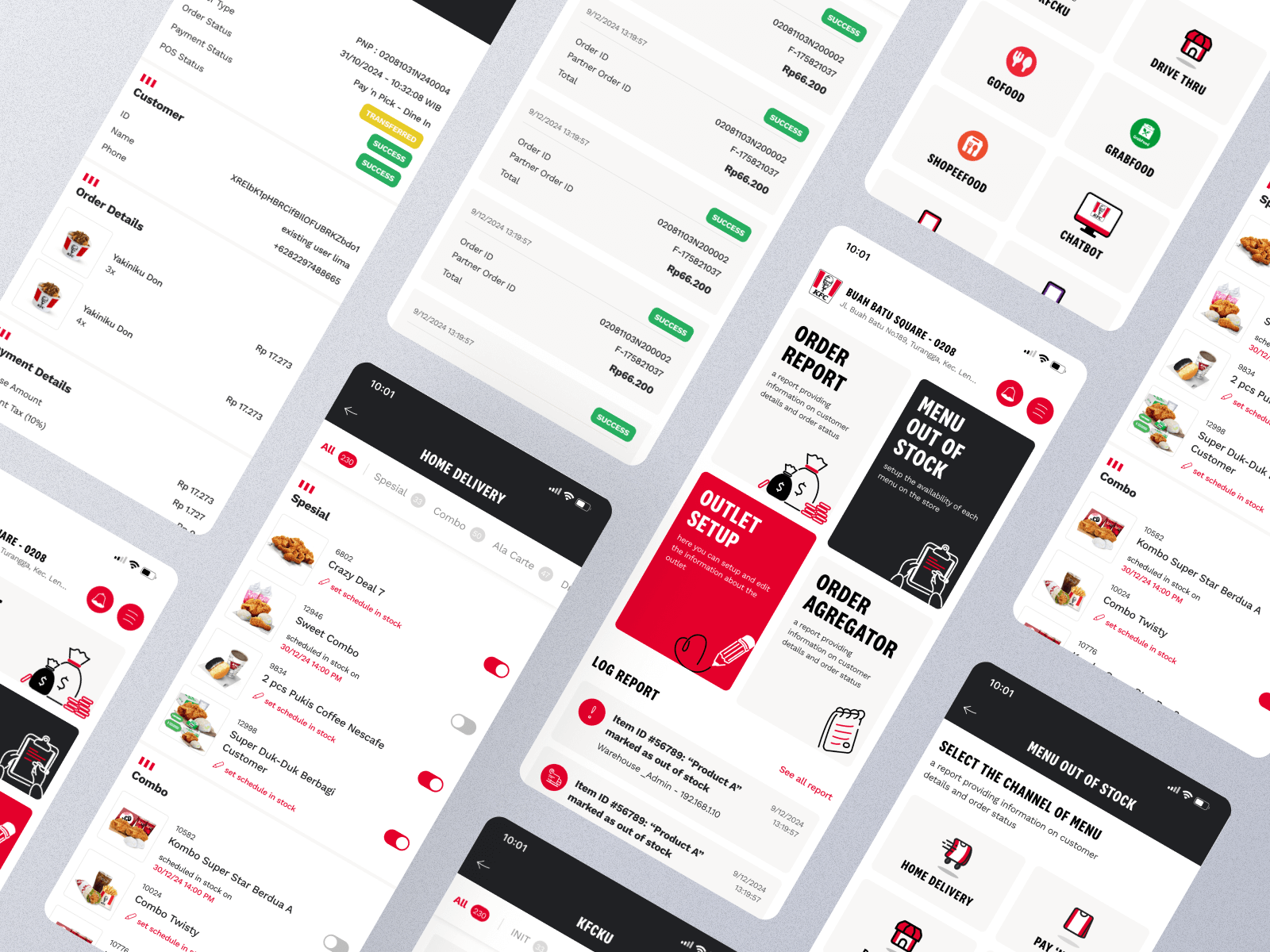
Approach
The redesign process began with a complete UX audit to identify pain points within the existing flow. Data visualization principles were applied to reorganize complex information into more digestible visual formats, such as cards, charts, and grouped sections. The new design adopted a clean, modular layout with a focus on readability and contrast, ensuring that key figures stand out at a glance. Interactive prototypes were created in Figma, allowing for validation of layout efficiency and information hierarchy through quick internal reviews.