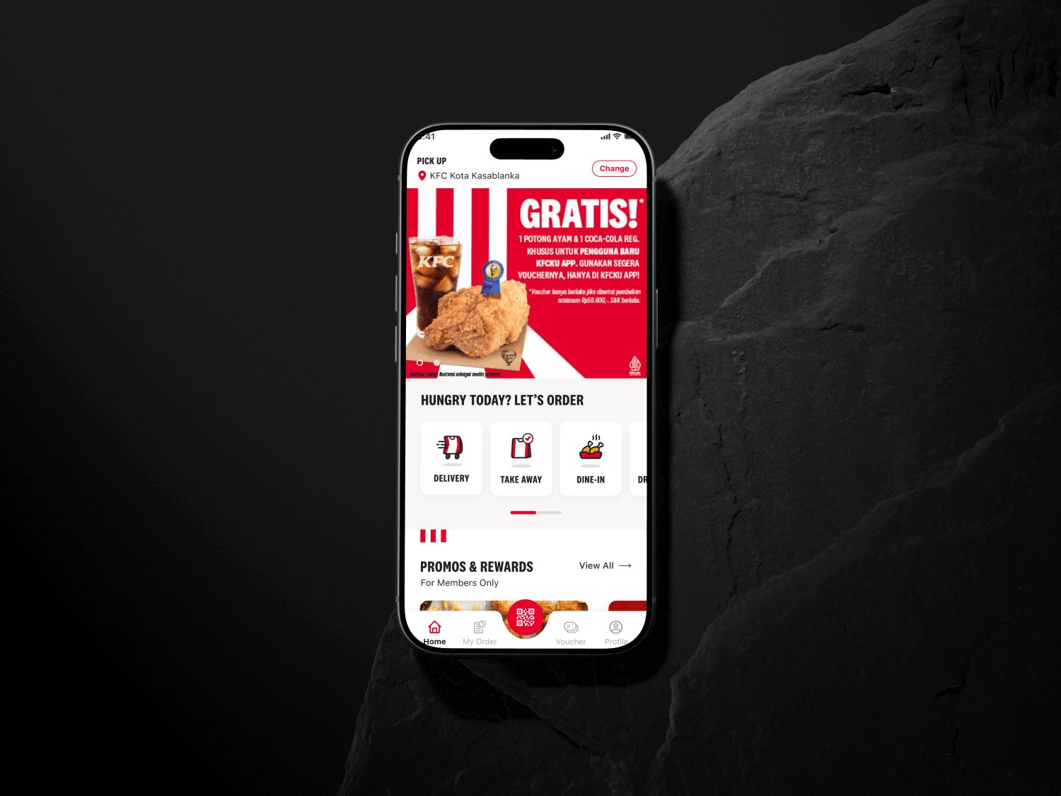
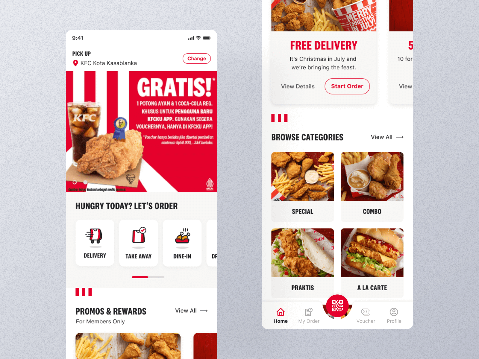
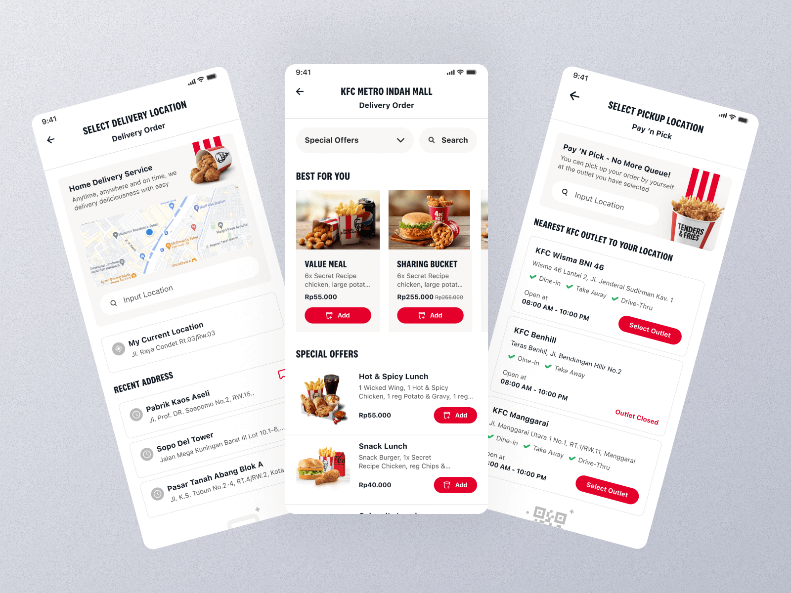
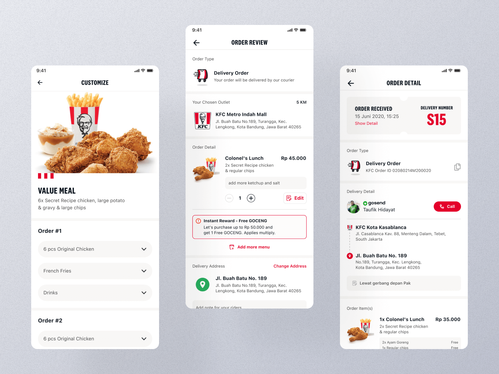
Approach
As the UI/UX Designer, I began by conducting a UX audit of the existing app to identify friction points and usability gaps. From there, I restructured the information hierarchy and refined key user flows — especially for ordering, payments, and reward redemption. The new visual direction adopted KFC’s signature red and white palette with a more modern layout, refined iconography, and improved micro-interactions to enhance engagement. Interactive prototypes were built in Figma, and multiple design iterations were tested to ensure the interface remained intuitive and visually appealing across various devices.